> ## Documentation Index
> Fetch the complete documentation index at: https://docs.depict.ai/llms.txt
> Use this file to discover all available pages before exploring further.
# Search customization overview
> Where to find Depict Search customization settings in Shopify, and how they are organized.
This section documents every merchant-facing setting for Depict Search and what each one does, for both **desktop** and **mobile**.
All settings live in the **Shopify theme editor**. To open it: **Shopify admin → Online Store → Themes → Customize** (on your live/selected theme).
There are two places settings live:
## A) App embeds (global search experience)
These control the whole search modal, regardless of how many search buttons you have.
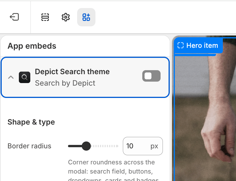 In the theme editor, click the **App embeds** icon in the left sidebar (the puzzle-piece / toggle icon near the bottom).
* **Depict Search layout** → layout & behaviour of the search modal. See [Search modal — Layout & behaviour](/shopify-guide/blocks/search-modal-layout).
In the theme editor, click the **App embeds** icon in the left sidebar (the puzzle-piece / toggle icon near the bottom).
* **Depict Search layout** → layout & behaviour of the search modal. See [Search modal — Layout & behaviour](/shopify-guide/blocks/search-modal-layout).
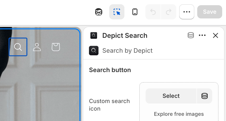 * **Depict Search theme** → visual theming of the search modal. See [Search modal — Theming](/shopify-guide/blocks/search-modal-theming).
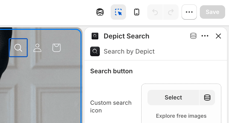 Make sure the embed's toggle is **enabled**, adjust the settings, then click **Save**.
## B) Search button block (the on-page button)
This controls only the button that opens search. See [Search button settings](/shopify-guide/blocks/search-button-settings).
In the theme editor, navigate to the page/section where the search button is placed (commonly the **Header**).
Make sure the embed's toggle is **enabled**, adjust the settings, then click **Save**.
## B) Search button block (the on-page button)
This controls only the button that opens search. See [Search button settings](/shopify-guide/blocks/search-button-settings).
In the theme editor, navigate to the page/section where the search button is placed (commonly the **Header**).
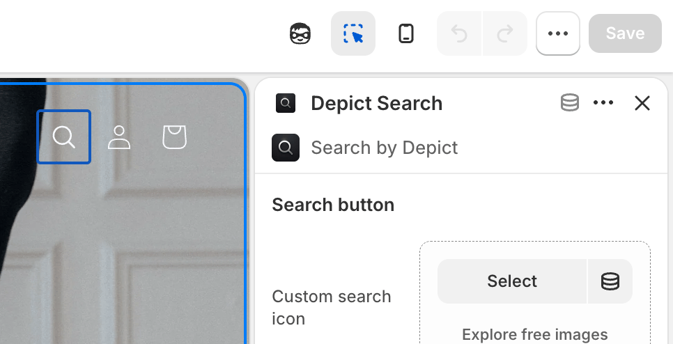 Select the **Depict Search** block to reveal its settings.
Adjust the settings, then click **Save**.
The search modal is a single, global UI. Its experience (grid, cards, theming, logo, mobile layout) is configured once in the **app embeds** — not per button — so the configuration is unambiguous no matter how many search buttons you place. The **Search button** block only styles the button itself.
## How settings are organized
Each settings page uses an **Applies to** column to indicate whether a setting affects the desktop view, the mobile view, or both.
Styling for the button that opens the search modal.
Grid, product card, mobile layout, suggestions and header logo.
Shape, typography, colors, dark mode and custom CSS.
Select the **Depict Search** block to reveal its settings.
Adjust the settings, then click **Save**.
The search modal is a single, global UI. Its experience (grid, cards, theming, logo, mobile layout) is configured once in the **app embeds** — not per button — so the configuration is unambiguous no matter how many search buttons you place. The **Search button** block only styles the button itself.
## How settings are organized
Each settings page uses an **Applies to** column to indicate whether a setting affects the desktop view, the mobile view, or both.
Styling for the button that opens the search modal.
Grid, product card, mobile layout, suggestions and header logo.
Shape, typography, colors, dark mode and custom CSS.