> ## Documentation Index
> Fetch the complete documentation index at: https://docs.depict.ai/llms.txt
> Use this file to discover all available pages before exploring further.
# Layout & behaviour
> Global layout and behaviour settings for the Depict search modal (app embed: Depict Search layout).
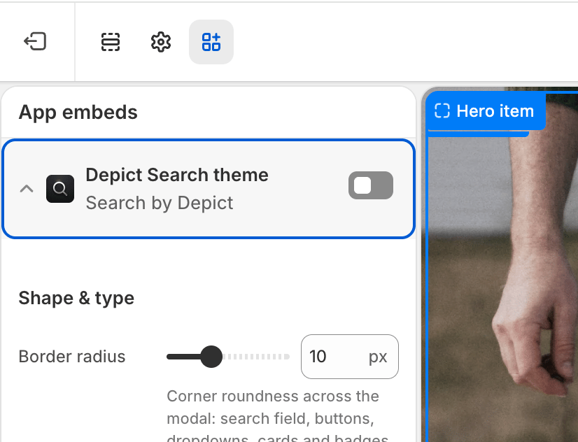 Global settings for how the search modal is laid out and behaves. These are configured once and apply to every search button on your store.
To edit these settings: **Shopify admin → Online Store → Themes → Customize → App embeds**, then expand **Depict Search layout**. See [Search customization overview](/shopify-guide/blocks/search-customization-overview) for a full walkthrough.
## Product grid
| Setting | Description | Values / Default | Applies to |
| -------------------------------------- | ------------------------------------------------------------------------------------------------------------------------------------------------------------------------- | ------------------------------------------ | ---------------- |
| Show products in empty state on mobile | Show product recommendations immediately after opening search on mobile. Exposes more products, but can look crammed alongside the virtual keyboard. | On / Off · default `Off` | Mobile |
| Product card minimum size | Minimum width of each product card. The desktop grid fits as many cards as possible while keeping each at least this wide, automatically adjusting the number of columns. | `100`–`450` px (step 10) · default `260px` | Desktop |
| Product grid gap | Spacing between product cards in the grid. | `0`–`100` px · default `20px` | Desktop & Mobile |
## Product card
| Setting | Description | Values / Default | Applies to |
| ---------------------------------------- | ---------------------------------------------------------------------------------------------------------------------------------------------- | ------------------------------------------------------------------------------------------------------------------------------------------- | ---------------- |
| Product image aspect ratio | Aspect ratio for product card images. | Square (1:1), Portrait (3:4), Portrait (2:3), Portrait (4:5), Landscape (4:3), Landscape (3:2), Landscape (16:9) · default `Portrait (2:3)` | Desktop & Mobile |
| Show percentage off for on-sale products | Display the discount percentage on products that are on sale. | On / Off · default `Off` | Desktop & Mobile |
| Hide product title | Hide the product name on each card. | On / Off · default `Off` | Desktop & Mobile |
| Hide product price | Hide the price on each card. | On / Off · default `Off` | Desktop & Mobile |
| Red background on sale price | Highlight the price with a red background when the product is on sale. The corners follow the global **Border radius** (from the theme embed). | On / Off · default `Off` | Desktop & Mobile |
## Mobile layout
| Setting | Description | Values / Default | Applies to |
| -------------------------- | ----------------------------------------------------------------------------------------------------------------- | --------------------------------------------------------------------- | ---------- |
| Mobile search bar position | Where the search input sits on mobile: pinned to the bottom of the screen, or docked at the top under the header. | Bottom, Top · default `Bottom` | Mobile |
| Mobile submit button icon | Icon shown on the submit button next to the search field on mobile. | Chevron, Arrow up (send), Magnifier, Return arrow · default `Chevron` | Mobile |
## Search suggestions
| Setting | Description | Values / Default | Applies to |
| ------------------- | ------------------------------------------------------------------------------------------------------------------------------------------------------------------------------------------------------------------------------------------- | --------------------------------- | ---------------- |
| Custom search icon | Replaces the built-in magnifier shown in the search input field and in result-state messages (e.g. "No exact matches" and "no results"). Best with a simple, square, single-color icon. Leave empty for the default. | Image (optional) | Desktop & Mobile |
| Suggestions heading | Heading shown above the recommended searches in the suggestions dropdown (the default state, before the shopper types). Leave empty to hide it. | Text · default `Popular searches` | Desktop & Mobile |
| Top picks heading | Heading shown above the recommended products on the search start screen. Leave empty to use the default ("Our Top Picks", translated automatically per locale). Styled as a small uppercase section label to match the suggestions heading. | Text (optional) | Desktop & Mobile |
## Header logo
| Setting | Description | Values / Default | Applies to |
| -------------------------- | ---------------------------------------------------------------------------------------------------------------------------------- | ----------------------------- | ---------------- |
| Show logo in search header | Master switch for the logo in the top-left of the search modal. When on, your Shopify brand logo is used unless overridden below. | On / Off · default `On` | Desktop & Mobile |
| Logo type | Whether the header logo is an image or a text wordmark. | Image, Text · default `Image` | Desktop & Mobile |
| Logo text | Wordmark text shown when *Logo type* is **Text**. Defaults to your store name when empty. | Text (optional) | Desktop & Mobile |
| Text logo font size (px) | Pixel size for the text logo (e.g. `24`). Leave empty to match the **Base font size** from the theme embed. | Number in px (optional) | Desktop & Mobile |
| Logo image (desktop) | Header logo image on desktop when *Logo type* is **Image**. Falls back to your Shopify brand logo (Settings → Brand) when empty. | Image (optional) | Desktop |
| Logo image (mobile) | Header logo image on mobile when *Logo type* is **Image**. Falls back to the desktop logo (or your Shopify brand logo) when empty. | Image (optional) | Mobile |
The header logo is clickable — clicking it closes the search overlay, the same as the close (✕) button.
## Advanced
| Setting | Description | Values / Default | Applies to |
| ----------------------- | ----------------------------------------------------------------------------------------------------------------------------------------- | ------------------------ | ---------------- |
| Use custom product card | Render a `` custom element instead of the default card. Requires registering the custom element with JavaScript. | On / Off · default `Off` | Desktop & Mobile |
| Disable top layer | Enable if you position the modal with custom CSS and need the rest of the page to stay interactive. Watch for z-index issues. | On / Off · default `Off` | Desktop only |
Global settings for how the search modal is laid out and behaves. These are configured once and apply to every search button on your store.
To edit these settings: **Shopify admin → Online Store → Themes → Customize → App embeds**, then expand **Depict Search layout**. See [Search customization overview](/shopify-guide/blocks/search-customization-overview) for a full walkthrough.
## Product grid
| Setting | Description | Values / Default | Applies to |
| -------------------------------------- | ------------------------------------------------------------------------------------------------------------------------------------------------------------------------- | ------------------------------------------ | ---------------- |
| Show products in empty state on mobile | Show product recommendations immediately after opening search on mobile. Exposes more products, but can look crammed alongside the virtual keyboard. | On / Off · default `Off` | Mobile |
| Product card minimum size | Minimum width of each product card. The desktop grid fits as many cards as possible while keeping each at least this wide, automatically adjusting the number of columns. | `100`–`450` px (step 10) · default `260px` | Desktop |
| Product grid gap | Spacing between product cards in the grid. | `0`–`100` px · default `20px` | Desktop & Mobile |
## Product card
| Setting | Description | Values / Default | Applies to |
| ---------------------------------------- | ---------------------------------------------------------------------------------------------------------------------------------------------- | ------------------------------------------------------------------------------------------------------------------------------------------- | ---------------- |
| Product image aspect ratio | Aspect ratio for product card images. | Square (1:1), Portrait (3:4), Portrait (2:3), Portrait (4:5), Landscape (4:3), Landscape (3:2), Landscape (16:9) · default `Portrait (2:3)` | Desktop & Mobile |
| Show percentage off for on-sale products | Display the discount percentage on products that are on sale. | On / Off · default `Off` | Desktop & Mobile |
| Hide product title | Hide the product name on each card. | On / Off · default `Off` | Desktop & Mobile |
| Hide product price | Hide the price on each card. | On / Off · default `Off` | Desktop & Mobile |
| Red background on sale price | Highlight the price with a red background when the product is on sale. The corners follow the global **Border radius** (from the theme embed). | On / Off · default `Off` | Desktop & Mobile |
## Mobile layout
| Setting | Description | Values / Default | Applies to |
| -------------------------- | ----------------------------------------------------------------------------------------------------------------- | --------------------------------------------------------------------- | ---------- |
| Mobile search bar position | Where the search input sits on mobile: pinned to the bottom of the screen, or docked at the top under the header. | Bottom, Top · default `Bottom` | Mobile |
| Mobile submit button icon | Icon shown on the submit button next to the search field on mobile. | Chevron, Arrow up (send), Magnifier, Return arrow · default `Chevron` | Mobile |
## Search suggestions
| Setting | Description | Values / Default | Applies to |
| ------------------- | ------------------------------------------------------------------------------------------------------------------------------------------------------------------------------------------------------------------------------------------- | --------------------------------- | ---------------- |
| Custom search icon | Replaces the built-in magnifier shown in the search input field and in result-state messages (e.g. "No exact matches" and "no results"). Best with a simple, square, single-color icon. Leave empty for the default. | Image (optional) | Desktop & Mobile |
| Suggestions heading | Heading shown above the recommended searches in the suggestions dropdown (the default state, before the shopper types). Leave empty to hide it. | Text · default `Popular searches` | Desktop & Mobile |
| Top picks heading | Heading shown above the recommended products on the search start screen. Leave empty to use the default ("Our Top Picks", translated automatically per locale). Styled as a small uppercase section label to match the suggestions heading. | Text (optional) | Desktop & Mobile |
## Header logo
| Setting | Description | Values / Default | Applies to |
| -------------------------- | ---------------------------------------------------------------------------------------------------------------------------------- | ----------------------------- | ---------------- |
| Show logo in search header | Master switch for the logo in the top-left of the search modal. When on, your Shopify brand logo is used unless overridden below. | On / Off · default `On` | Desktop & Mobile |
| Logo type | Whether the header logo is an image or a text wordmark. | Image, Text · default `Image` | Desktop & Mobile |
| Logo text | Wordmark text shown when *Logo type* is **Text**. Defaults to your store name when empty. | Text (optional) | Desktop & Mobile |
| Text logo font size (px) | Pixel size for the text logo (e.g. `24`). Leave empty to match the **Base font size** from the theme embed. | Number in px (optional) | Desktop & Mobile |
| Logo image (desktop) | Header logo image on desktop when *Logo type* is **Image**. Falls back to your Shopify brand logo (Settings → Brand) when empty. | Image (optional) | Desktop |
| Logo image (mobile) | Header logo image on mobile when *Logo type* is **Image**. Falls back to the desktop logo (or your Shopify brand logo) when empty. | Image (optional) | Mobile |
The header logo is clickable — clicking it closes the search overlay, the same as the close (✕) button.
## Advanced
| Setting | Description | Values / Default | Applies to |
| ----------------------- | ----------------------------------------------------------------------------------------------------------------------------------------- | ------------------------ | ---------------- |
| Use custom product card | Render a `` custom element instead of the default card. Requires registering the custom element with JavaScript. | On / Off · default `Off` | Desktop & Mobile |
| Disable top layer | Enable if you position the modal with custom CSS and need the rest of the page to stay interactive. Watch for z-index issues. | On / Off · default `Off` | Desktop only |