> ## Documentation Index
> Fetch the complete documentation index at: https://docs.depict.ai/llms.txt
> Use this file to discover all available pages before exploring further.
# Theming
> Global visual styling for the Depict search modal (app embed: Depict Search theme).
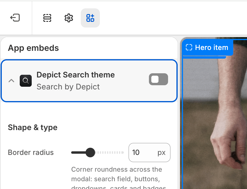 Global visual styling of the search modal. The baseline stylesheet has sensible defaults, so the modal still renders correctly if this embed is disabled.
To edit these settings: **Shopify admin → Online Store → Themes → Customize → App embeds**, then expand **Depict Search theme**. See [Search customization overview](/shopify-guide/blocks/search-customization-overview) for a full walkthrough.
## Shape & type
| Setting | Description | Values / Default | Applies to |
| -------------- | -------------------------------------------------------------------------------------------------------------------------------------------------------------------------------------------------------------------------------------------------------------------- | ------------------------------------- | ---------------- |
| Border radius | Corner roundness used across the modal: the search field, the filter / sort / grid-layout / "view all" buttons and their dropdowns, the product cards, and the in-card badges (kept slightly rounder than the card). Set to `0` for fully square corners everywhere. | `0`–`30` px (step 1) · default `10px` | Desktop & Mobile |
| Base font size | Base font size for the whole modal. Every other text (headings, labels, results) scales relative to this. An absolute unit (px) stays fixed; a relative unit (em / %) scales with your store's base font size. Leave empty to inherit your store's font size. | CSS font size (optional) | Desktop & Mobile |
## Product card
| Setting | Description | Values / Default | Applies to |
| -------------------- | ------------------------------------------------------------------------------------------------------------------------------------------ | --------------------------------------------------------------------------------------------- | ---------------- |
| Text case | Text casing for product card text. | None, Capitalize Each Word, UPPERCASE, lowercase, full-width, Full-size Kana · default `None` | Desktop & Mobile |
| Font family | Font for product card text. Enter a CSS font-family value, e.g. `"Poppins", sans-serif`. Leave empty to inherit the modal font. | CSS font-family (optional) | Desktop & Mobile |
| Font size | Font size for product card text. Leave empty to use the Base font size, falling through to your store's font size when that is also empty. | CSS font size (optional) | Desktop & Mobile |
| Sale price color | Color of the sale price when a product is on sale. Leave empty for the default. | Color (optional) | Desktop & Mobile |
| Original price color | Color of the original (crossed-out) price when a product is on sale. Leave empty for the default. | Color (optional) | Desktop & Mobile |
## Modal styling
| Setting | Description | Values / Default | Applies to |
| ----------------- | -------------------------------------------------------------------- | ------------------------ | ---------------- |
| Enable dark theme | Applies dark styling to the entire modal. | On / Off · default `Off` | Desktop & Mobile |
| Custom CSS | Free-form CSS injected globally into the modal, for advanced tweaks. | CSS (optional) | Desktop & Mobile |
Global visual styling of the search modal. The baseline stylesheet has sensible defaults, so the modal still renders correctly if this embed is disabled.
To edit these settings: **Shopify admin → Online Store → Themes → Customize → App embeds**, then expand **Depict Search theme**. See [Search customization overview](/shopify-guide/blocks/search-customization-overview) for a full walkthrough.
## Shape & type
| Setting | Description | Values / Default | Applies to |
| -------------- | -------------------------------------------------------------------------------------------------------------------------------------------------------------------------------------------------------------------------------------------------------------------- | ------------------------------------- | ---------------- |
| Border radius | Corner roundness used across the modal: the search field, the filter / sort / grid-layout / "view all" buttons and their dropdowns, the product cards, and the in-card badges (kept slightly rounder than the card). Set to `0` for fully square corners everywhere. | `0`–`30` px (step 1) · default `10px` | Desktop & Mobile |
| Base font size | Base font size for the whole modal. Every other text (headings, labels, results) scales relative to this. An absolute unit (px) stays fixed; a relative unit (em / %) scales with your store's base font size. Leave empty to inherit your store's font size. | CSS font size (optional) | Desktop & Mobile |
## Product card
| Setting | Description | Values / Default | Applies to |
| -------------------- | ------------------------------------------------------------------------------------------------------------------------------------------ | --------------------------------------------------------------------------------------------- | ---------------- |
| Text case | Text casing for product card text. | None, Capitalize Each Word, UPPERCASE, lowercase, full-width, Full-size Kana · default `None` | Desktop & Mobile |
| Font family | Font for product card text. Enter a CSS font-family value, e.g. `"Poppins", sans-serif`. Leave empty to inherit the modal font. | CSS font-family (optional) | Desktop & Mobile |
| Font size | Font size for product card text. Leave empty to use the Base font size, falling through to your store's font size when that is also empty. | CSS font size (optional) | Desktop & Mobile |
| Sale price color | Color of the sale price when a product is on sale. Leave empty for the default. | Color (optional) | Desktop & Mobile |
| Original price color | Color of the original (crossed-out) price when a product is on sale. Leave empty for the default. | Color (optional) | Desktop & Mobile |
## Modal styling
| Setting | Description | Values / Default | Applies to |
| ----------------- | -------------------------------------------------------------------- | ------------------------ | ---------------- |
| Enable dark theme | Applies dark styling to the entire modal. | On / Off · default `Off` | Desktop & Mobile |
| Custom CSS | Free-form CSS injected globally into the modal, for advanced tweaks. | CSS (optional) | Desktop & Mobile |