

Requirements
For both search and product listing pages, you need to set up your product card component. That component will receive adisplay of the type YourDisplay (see previous page) OR null.
If display is null, it means that there’s no data for this product card yet, and you should display a product card as close to the dimensions as the one you’ll display when you’ll have data, we’ll call this a “placeholder”. The placeholder serves as a loading indicator for users as well as enabling scroll restoration when going back and minimizing content shift.
Example expected output of your product card component
The same card in its two states. Left:display is null, so the card draws the placeholder at the final dimensions. Right: the display has loaded and the card shows image, title and price.

Loading state: display is null
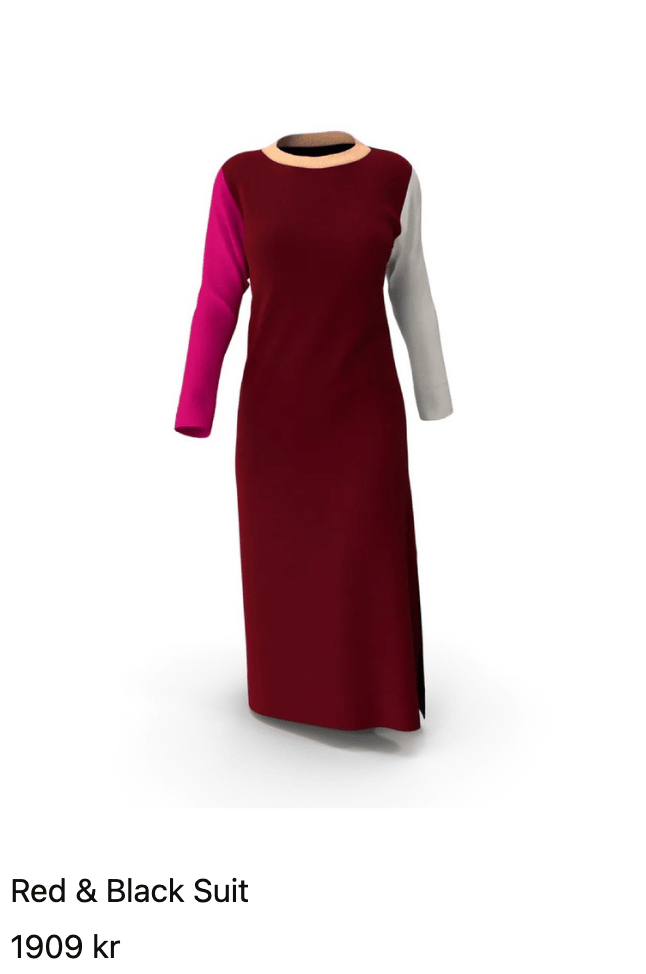
Loaded state: display is your display type
Provided placeholder components
To make it easier for you to create a placeholder, the SDK exports two shimmering placeholder components. Their usage is shown in the code example below.ImagePlaceholder
Renders a shimmering placeholder in place of an image. Set aspectRatio to match the dimensions of your product images. Alternatively, set width and height (instead of aspectRatio) to use it as a block-mode placeholder.
TextPlaceholder
Renders a shimmering placeholder in place of text, such as a title or price. Set width and height to match the dimensions of the text it stands in for.
Displaying color swatches
Code example
You probably have an existing product card which you just can add placeholder functionality for. Here’s an example of how it could look like:Note how we branch off to the shimmering placeholder effect in place of the content, when there is no content