

Limits and behavior
- Metrics cover the last 30 days compared with the previous 30 days by default; the presets are 30, 7 and 1 days, plus a custom range. The drawer has its own period picker.
- Add-to-cart facts appear only when add-to-cart events are tracked; they keep their product-performance basis.
- Collection engagement uses Recorded collection visitors, Recorded clicking visitors and Visitor CTR for the selected markets and period. Revenue, Units and STR retain their existing definitions. There is no inventory column and no pinned-vs-auto column in the collections table.
- Recorded collection visitors and clickers describe devices observed on that collection’s own page. Earlier product-based figures added activity on the collection’s current products, including activity elsewhere. The definitions are not directly comparable, and lower numbers alone do not show lost traffic.
- Missing or withheld engagement shows —. A Tracking unreliable warning withholds Visitor CTR throughout the selected scope; otherwise eligible visitor and clicker counts remain. See Fix collection-page tracking.
- Dead stock counts products with inventory but zero units sold in the selected period.
- Average stock coverage is the number of days current inventory lasts at the current sales rate; it appears in the analytics drawer, not in the collections table.
- Pinned vs Auto needs enough traffic on both your pins and the automatically ordered products before it gives a verdict.
KPI row
The tiles above the collections table retain their existing revenue and product-performance definitions:- Collection Revenue — revenue attributed to collection pages in the period.
- Current product performance — current-product views and clicks, with add-to-cart and order facts shown separately from collection engagement.
The analytics drawer
Open the drawer from a collection row’s View analytics button.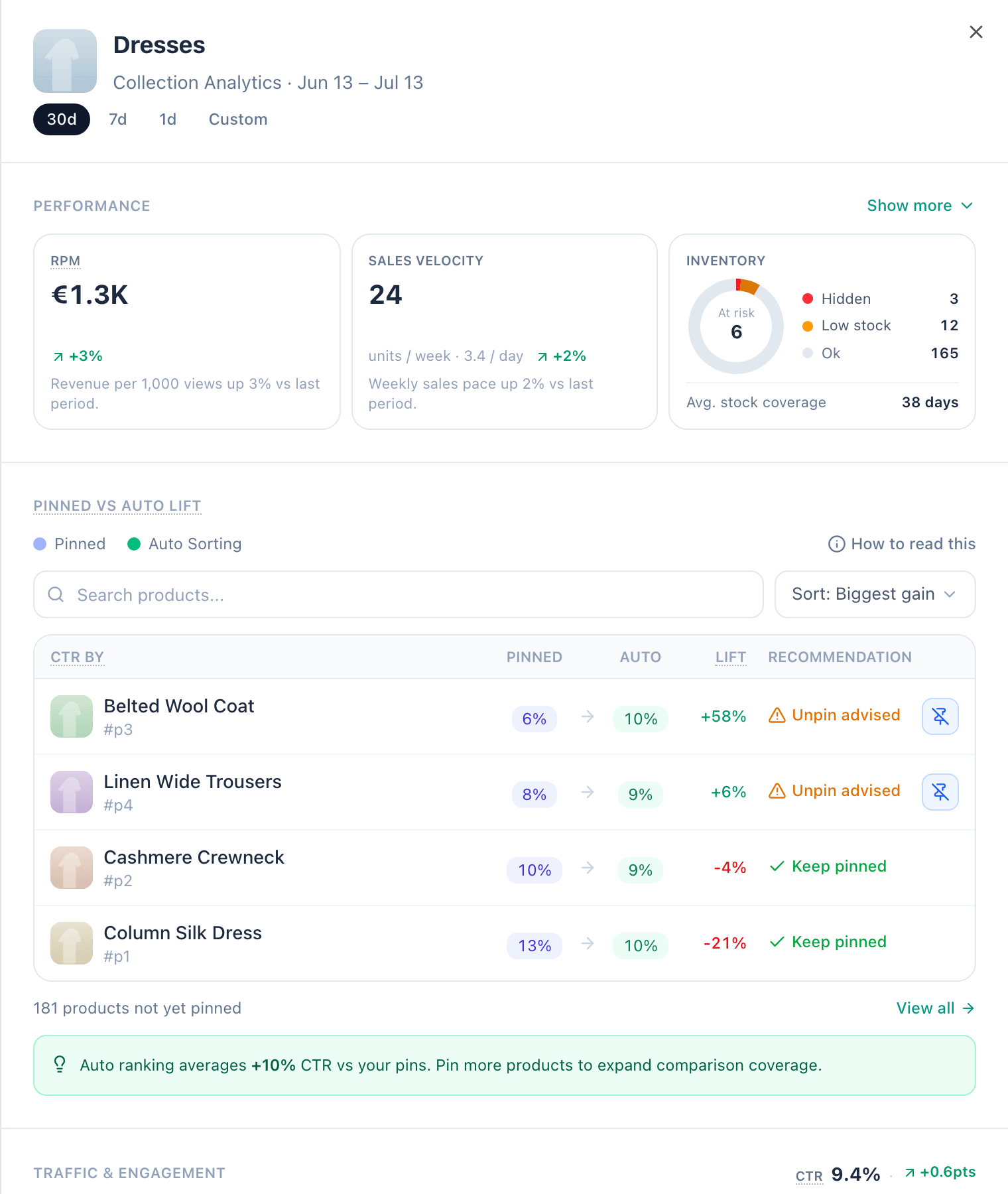
The analytics drawer: performance KPIs, inventory breakdown and the Pinned vs Auto comparison.
Performance
Current product performance keeps revenue, Product CTR and sell-through on their existing product basis, with previous-period deltas and trend charts where available. Show more adds RPM (revenue per thousand product impressions), sales velocity, inventory and variant availability — in-stock variants as a share of all variants in the collection. These values are separate from Visitor CTR and recorded collection visitors. A product metric is never substituted for an unavailable visitor metric.Collection engagement
Recorded collection visitors, Recorded clicking visitors and Visitor CTR describe recorded devices on this collection’s own page. Visitor CTR is clicking visitors divided by collection visitors, when the row and the selected scope are eligible. Tracking quality and availability are checked separately for the current and previous periods; an unavailable previous value does not hide an eligible current count. Product impressions, add-to-cart events and sales retain their own bases. They are not connected to recorded collection visitors with cross-basis conversion rates. The click cut-off describes how far down the listing shoppers reach before 95% of recorded clicks are accounted for.Pinned vs Auto Lift
How your pinned products compare with auto-ranked ones — see Pinned vs Auto.Product Health
The collection’s Top 3 Sellers and Bottom 3 Sellers. Show more opens the full ranking.Stock Health
The Stock Health view lists the collection’s low-stock variants and dead-stock risk in one place. Open it from the variant availability tile in the drawer’s Performance section (under Show more); the tile also says how many products are low on stock or at dead stock risk.Pinned vs Auto
For collections with pinned products, Depict compares the click-through rate of your pinned products with what automatic ordering would get, and turns the result into a recommendation:
The drawer and the Pinned vs Auto modal break it down per product, with
the lift between the two CTRs, per-product recommendations, one-click
pin/unpin actions and CSV export. You can filter the list to Unpin
advised or Keep pinned. An info tooltip explains how to read the
numbers.
Inventory and dead stock
Dead stock counts products with stock but effectively no sales in the period — capital sitting still. Average stock coverage estimates how many days current inventory lasts at the current sales rate. The dead stock button above the collections table lists the specific products across all collections so you can act on them; the Stock Health view does the same for one collection.Benchmarking
The Benchmark button opens a modal where you compare any set of collections side by side — against each other and against the “All collections” baseline — across revenue, engagement and inventory metrics. Recorded engagement uses the same selected markets, period and availability rules as the collection table. Product snapshots keep their product basis; they are not compared with live visitor values as though the definitions were interchangeable.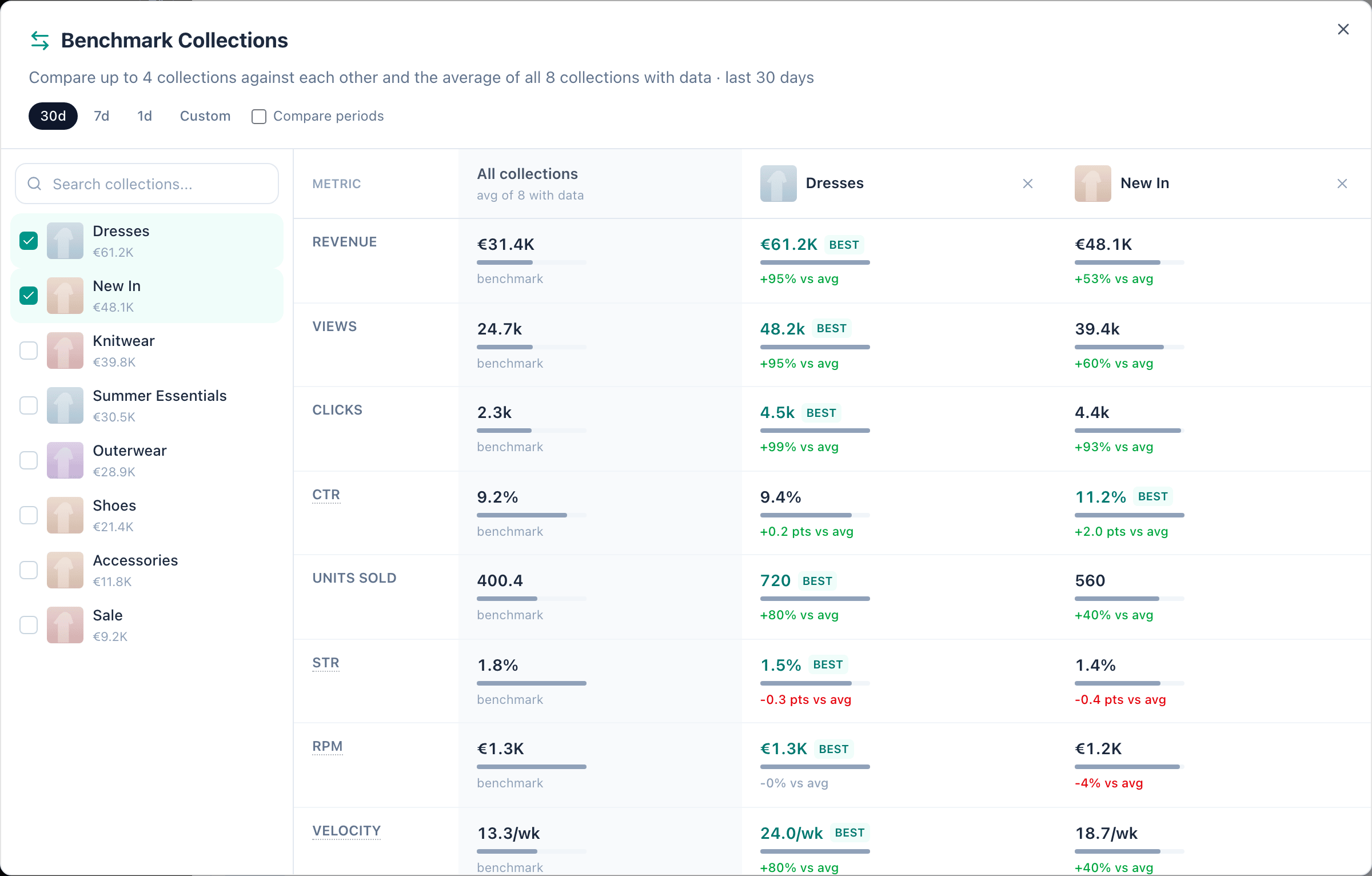
Benchmarking two collections against the all-collections average.
Fix collection-page tracking
Depict may withhold Visitor CTR when recorded collection visitors and clicking visitors are inconsistent for the selected markets and period. This warning describes the recorded data. It does not identify a single integration fault or prove that every unflagged row has complete tracking.What the collection numbers describe
Recorded collection visitors count devices associated with requests for that collection’s products. Recorded clicking visitors count devices whose product-card clicks were attributed to that listing. A product-detail page view, a card impression and a collection visitor describe different activity; one does not substitute for another. Visitor CTR is recorded clicking visitors divided by recorded collection visitors. When at least 10% of the returned collection rows in the selected markets and period have more recorded clickers than viewers, Depict marks that scope Tracking unreliable and withholds Visitor CTR on every collection in it. Otherwise eligible visitor and clicker counts remain available with the warning. They are recorded observations, not proof of complete tracking. The threshold is a warning rule, not an acceptable tracking-error rate. An inconsistent row has its visitor count and Visitor CTR withheld even when fewer than 10% of rows are inconsistent. Independently recorded clickers can remain available. Missing or withheld portal values show —; they are not invented zeros or rates capped at 100%. The Export Most Popular CSV uses the same definitions and rules, with empty cells for missing or withheld values. A different period or market scope can have a different warning and availability.Check the listing request and shopper identity
Ask the team maintaining your storefront to inspect a listing-products request in the browser’s network tools. Confirm that it addresses the intended collection and market and carries the shopper’s session identity. In the Platform API, the products request’ssession_id is required for
tracking and attribution even though it is optional for serving products.
A successful products response alone does not establish attributable
visitor coverage.
Use the same session identity in serving requests, DPC and custom events.
Do not replace all shoppers with one shared dummy identity. After
client-side navigation, confirm that the requested listing matches the
collection displayed. Follow your existing consent requirements; this
guide does not require sending events without consent.
See Listings and
Which ID goes where.
Check clicks against the display that was rendered
For custom product cards, use theproduct_listing_result_id from that
exact display as the card’s data-product-listing-result-id. Keep listing,
search and recommendation result IDs separate. Do not reuse an old
display’s result ID for a newly returned card.
Legacy Depict UI SDK cards already carry these attributes. Check the
integration before adding a second sender. The
Product Card Tracking guide covers the
attributes and custom event sending. The
ID guide
explains the ten-minute result-ID lifetime and event validation. Send clicks
promptly with the result ID from the clicked display.
If clicks arrive but listing visits do not, check the serving request’s
session identity and collection/market mapping alongside the click
integration. Adding only product-card impression events does not repair
missing listing-request visitor records.