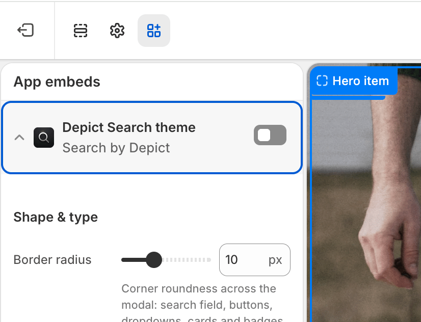
Global settings for how the search modal is laid out and behaves. These are configured once and apply to every search button on your store.
To edit these settings: Shopify admin → Online Store → Themes → Customize → App embeds, then expand Depict Search layout. See Search customization overview for a full walkthrough.
Product grid
| Setting | Description | Values / Default | Applies to |
|---|
| Show products in empty state on mobile | Show product recommendations immediately after opening search on mobile. Exposes more products, but can look crammed alongside the virtual keyboard. | On / Off · default Off | Mobile |
| Product card minimum size | Minimum width of each product card. The desktop grid fits as many cards as possible while keeping each at least this wide, automatically adjusting the number of columns. | 100–450 px (step 10) · default 260px | Desktop |
| Product grid gap | Spacing between product cards in the grid. | 0–100 px · default 20px | Desktop & Mobile |
Product card
| Setting | Description | Values / Default | Applies to |
|---|
| Product image aspect ratio | Aspect ratio for product card images. | Square (1:1), Portrait (3:4), Portrait (2:3), Portrait (4:5), Landscape (4:3), Landscape (3:2), Landscape (16:9) · default Portrait (2:3) | Desktop & Mobile |
| Show percentage off for on-sale products | Display the discount percentage on products that are on sale. | On / Off · default Off | Desktop & Mobile |
| Hide product title | Hide the product name on each card. | On / Off · default Off | Desktop & Mobile |
| Hide product price | Hide the price on each card. | On / Off · default Off | Desktop & Mobile |
| Red background on sale price | Highlight the price with a red background when the product is on sale. The corners follow the global Border radius (from the theme embed). | On / Off · default Off | Desktop & Mobile |
Mobile layout
| Setting | Description | Values / Default | Applies to |
|---|
| Mobile search bar position | Where the search input sits on mobile: pinned to the bottom of the screen, or docked at the top under the header. | Bottom, Top · default Bottom | Mobile |
| Mobile submit button icon | Icon shown on the submit button next to the search field on mobile. | Chevron, Arrow up (send), Magnifier, Return arrow · default Chevron | Mobile |
Search suggestions
| Setting | Description | Values / Default | Applies to |
|---|
| Custom search icon | Replaces the built-in magnifier shown in the search input field and in result-state messages (e.g. “No exact matches” and “no results”). Best with a simple, square, single-color icon. Leave empty for the default. | Image (optional) | Desktop & Mobile |
| Suggestions heading | Heading shown above the recommended searches in the suggestions dropdown (the default state, before the shopper types). Leave empty to hide it. | Text · default Popular searches | Desktop & Mobile |
| Top picks heading | Heading shown above the recommended products on the search start screen. Leave empty to use the default (“Our Top Picks”, translated automatically per locale). Styled as a small uppercase section label to match the suggestions heading. | Text (optional) | Desktop & Mobile |
| Setting | Description | Values / Default | Applies to |
|---|
| Show logo in search header | Master switch for the logo in the top-left of the search modal. When on, your Shopify brand logo is used unless overridden below. | On / Off · default On | Desktop & Mobile |
| Logo type | Whether the header logo is an image or a text wordmark. | Image, Text · default Image | Desktop & Mobile |
| Logo text | Wordmark text shown when Logo type is Text. Defaults to your store name when empty. | Text (optional) | Desktop & Mobile |
| Text logo font size (px) | Pixel size for the text logo (e.g. 24). Leave empty to match the Base font size from the theme embed. | Number in px (optional) | Desktop & Mobile |
| Logo image (desktop) | Header logo image on desktop when Logo type is Image. Falls back to your Shopify brand logo (Settings → Brand) when empty. | Image (optional) | Desktop |
| Logo image (mobile) | Header logo image on mobile when Logo type is Image. Falls back to the desktop logo (or your Shopify brand logo) when empty. | Image (optional) | Mobile |
The header logo is clickable — clicking it closes the search overlay, the same as the close (✕) button.
Advanced
| Setting | Description | Values / Default | Applies to |
|---|
| Use custom product card | Render a <gpt-search-product-card> custom element instead of the default card. Requires registering the custom element with JavaScript. | On / Off · default Off | Desktop & Mobile |
| Disable top layer | Enable if you position the modal with custom CSS and need the rest of the page to stay interactive. Watch for z-index issues. | On / Off · default Off | Desktop only |