

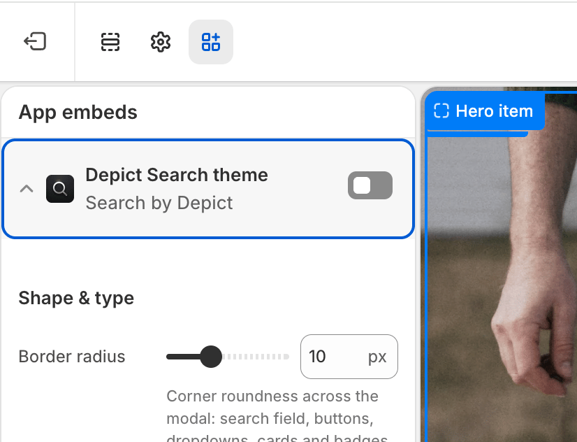
Shape & type
| Setting | Description | Values / Default | Applies to |
|---|---|---|---|
| Border radius | Corner roundness used across the modal: the search field, the filter / sort / grid-layout / “view all” buttons and their dropdowns, the product cards, and the in-card badges (kept slightly rounder than the card). Set to 0 for fully square corners everywhere. | 0–30 px (step 1) · default 10px | Desktop & Mobile |
| Base font size | Base font size for the whole modal. Every other text (headings, labels, results) scales relative to this. An absolute unit (px) stays fixed; a relative unit (em / %) scales with your store’s base font size. Leave empty to inherit your store’s font size. | CSS font size (optional) | Desktop & Mobile |
Product card
| Setting | Description | Values / Default | Applies to |
|---|---|---|---|
| Text case | Text casing for product card text. | None, Capitalize Each Word, UPPERCASE, lowercase, full-width, Full-size Kana · default None | Desktop & Mobile |
| Font family | Font for product card text. Enter a CSS font-family value, e.g. "Poppins", sans-serif. Leave empty to inherit the modal font. | CSS font-family (optional) | Desktop & Mobile |
| Font size | Font size for product card text. Leave empty to use the Base font size, falling through to your store’s font size when that is also empty. | CSS font size (optional) | Desktop & Mobile |
| Sale price color | Color of the sale price when a product is on sale. Leave empty for the default. | Color (optional) | Desktop & Mobile |
| Original price color | Color of the original (crossed-out) price when a product is on sale. Leave empty for the default. | Color (optional) | Desktop & Mobile |
Modal styling
| Setting | Description | Values / Default | Applies to |
|---|---|---|---|
| Enable dark theme | Applies dark styling to the entire modal. | On / Off · default Off | Desktop & Mobile |
| Custom CSS | Free-form CSS injected globally into the modal, for advanced tweaks. | CSS (optional) | Desktop & Mobile |