Getting started
Depending on which bundler (Webpack/Parcel/etc) you are using, style imports might differently. Either import@depict-ai/js-ui/@depict-ai/react-ui directly, or try importing @depict-ai/plp-styling which will already be installed as a transient dependency if you have either ui package installed. When importing the style module with @use, you can configure is as below.
SCSS
$border-radius variable and see what happens!
The first three lines define your customization through variables, and the last line imports the actual styling. When you import the actual styling, it’s important that you specify whether you want the styling for "search", "category", or both ("all").
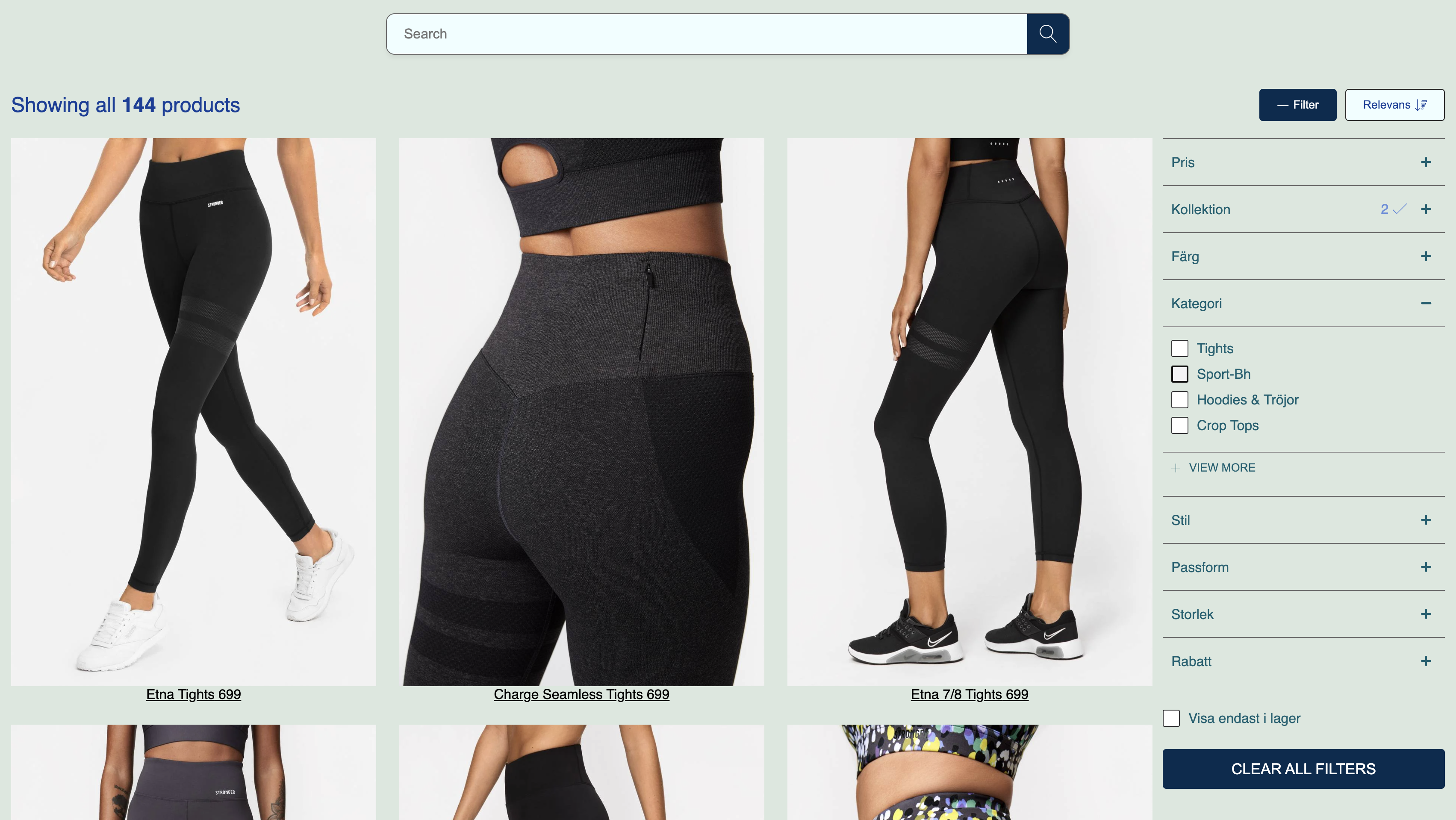
Declaring your page background color
Certain elements of the PLP styling system need to know the background color of the page. If your background isn’t white, you will have to declare it.SCSS
Color palettes
Backgrounds, text, and borders use the same color palette system. This section documents how a palette can be configured. A palette has four different types ("base", "neutral", "subtle", and "inverse"), and each type has four different states ("default", "hover", "pressed", and "disabled").
Example palette configurations:
SCSS
"default" state. If the "default" state isn’t specified for the type, the "default" state of the "base" type will be converted to be used, if that isn’t specified, a static default color will be used.
📘 The inference system isn’t perfectIt is likely that you will have to style individual components after specifying your color palette. The inference system is designed to give you a base which you can work from, but not capture the more fine-grained styling you are likely to need when representing your brand.
Further reference
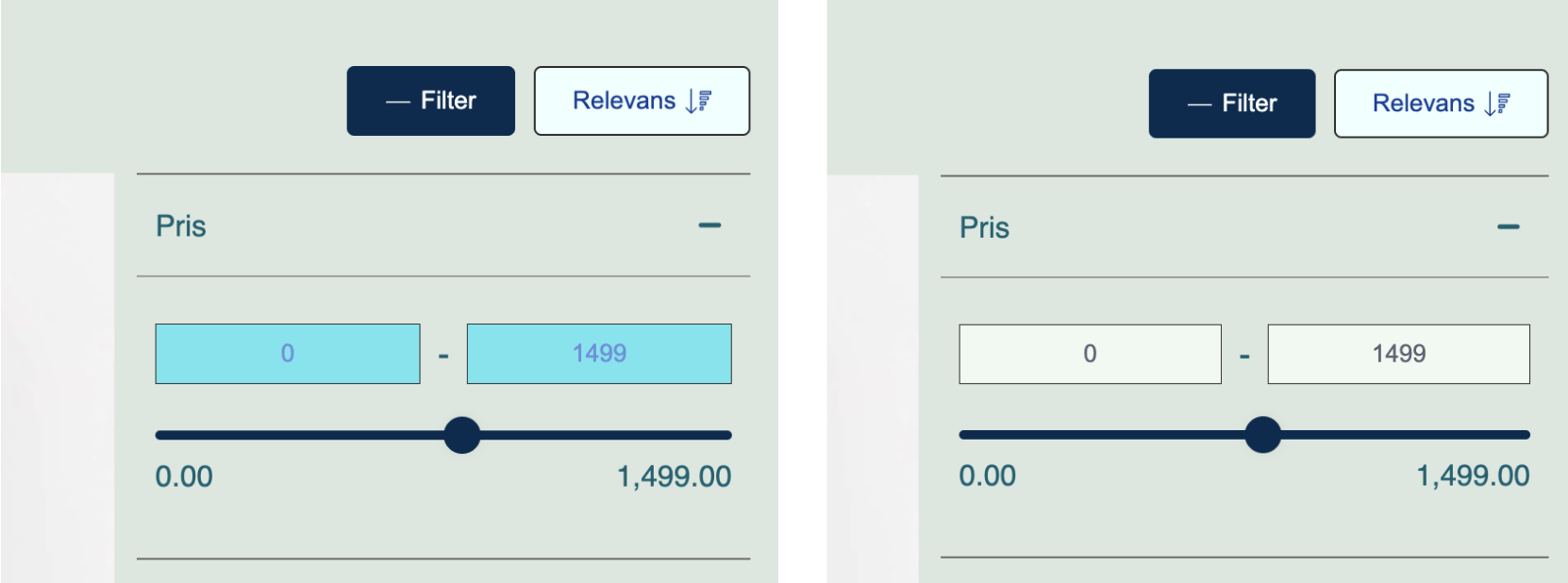
The custom variable interface is more complete than what was shown on this page. You can find documentation for the rest of the variables in this document under the “VARIABLES” section. Another option for more fine-grained styling control is described below.Modifying without custom variables
Many developers might prefer using familiar CSS/SCSS for the majority of their styling, and use our custom variables interface as little as possible. This is totally valid! Every component of the PLP has class names that you can target for custom styling. We recommend starting your selector with an id to ensure your styling has higher precedence than ours. The below example targets the input fields of the price range filter. It corrects some bad-looking colors that the inference system came up with.SCSS